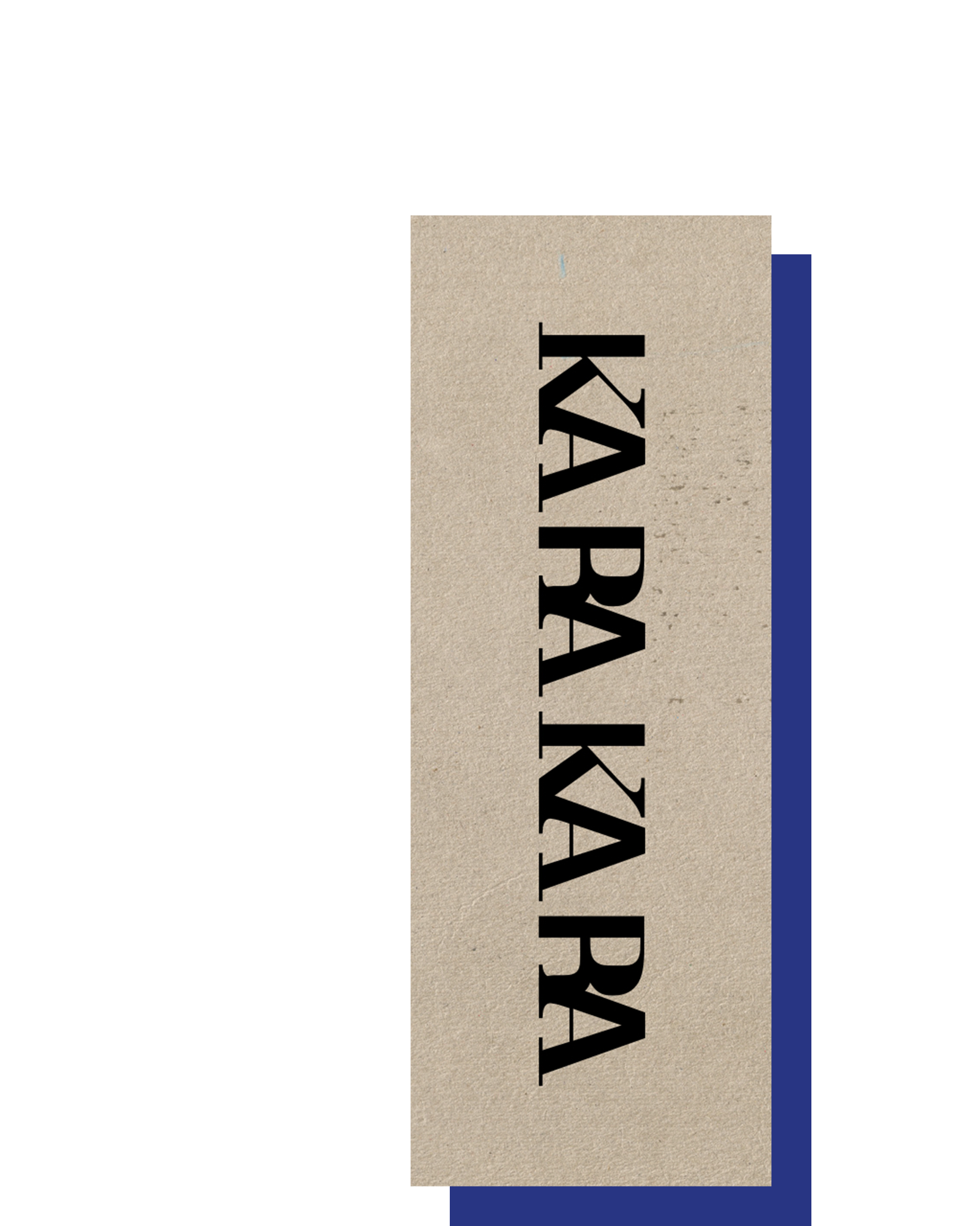
Variable Music
2022
Konzeption, Type Design, Typografie
Im Laufe meiner Masterarbeit recherchierte ich die Entstehung und Entwicklung der westlichen Musiktypografie. Dabei wurde schnell klar, dass die stilistische Entwicklung seit dem 19. Jahrhundert nur noch schleppend vorangekommen ist. Ein Großteil der heute genutzten Notenschriften leitet sich von klassizistischen Antiqua-Schriften wie Bodoni und Didot ab. Während meiner Recherche sammelte ich Gründe für diese Stagnation und sprach mit Experten über die Zukunft der Musiktypografie.
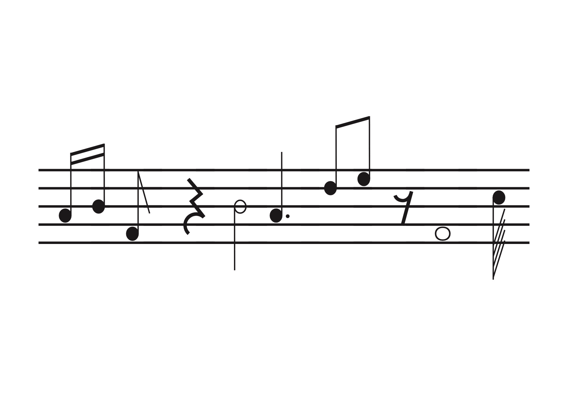
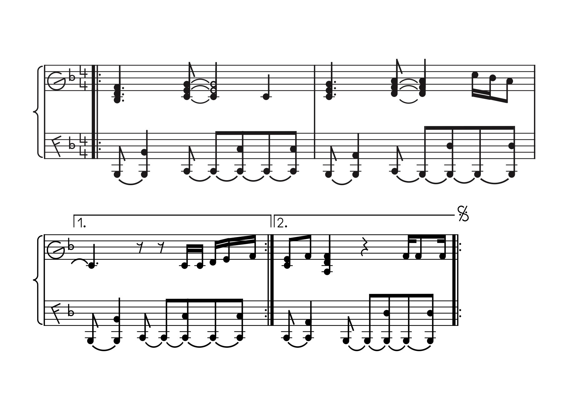
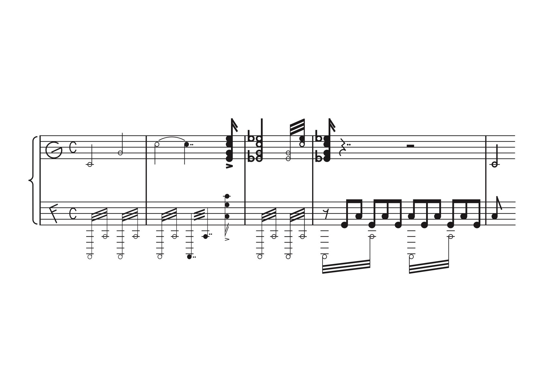
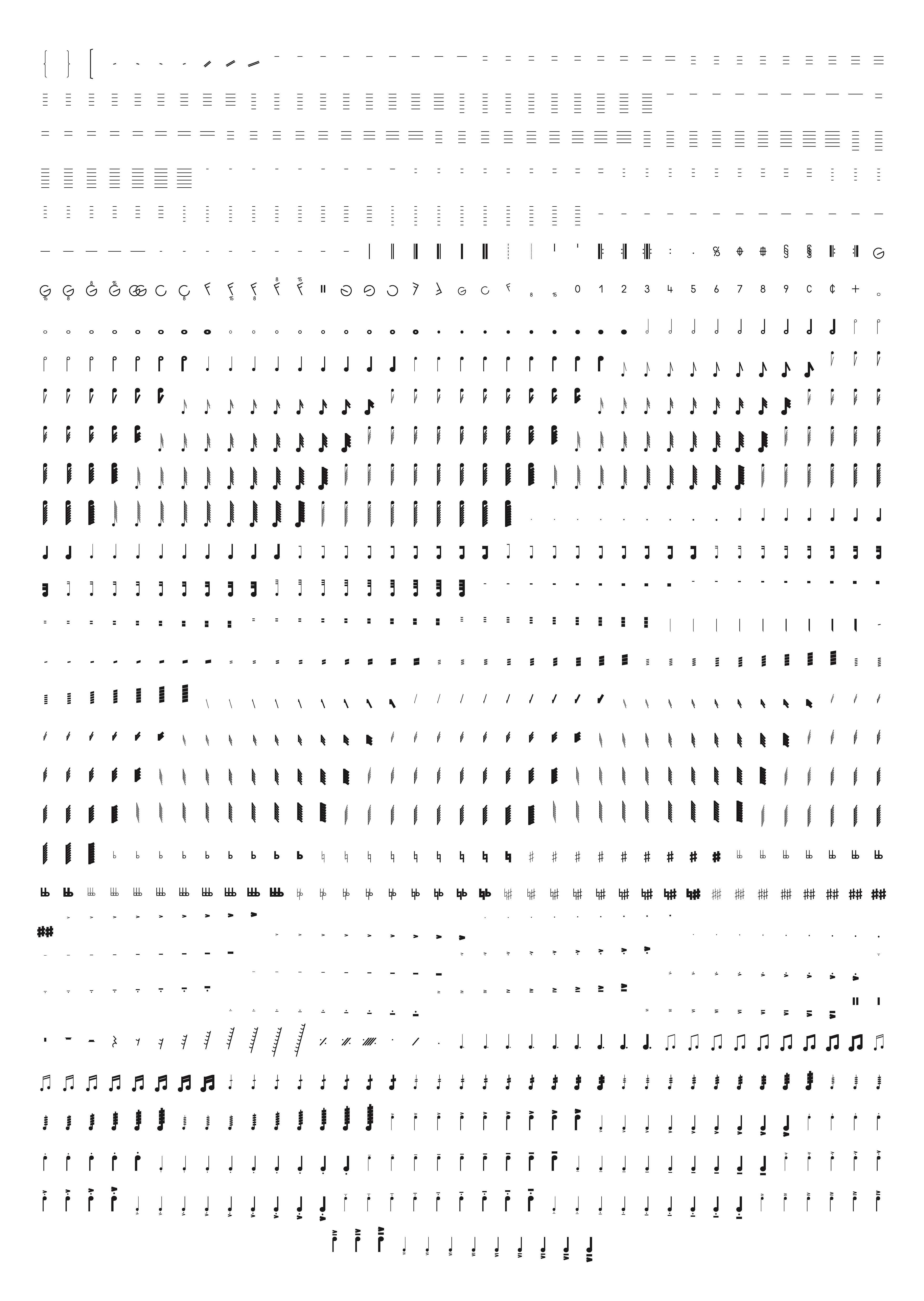
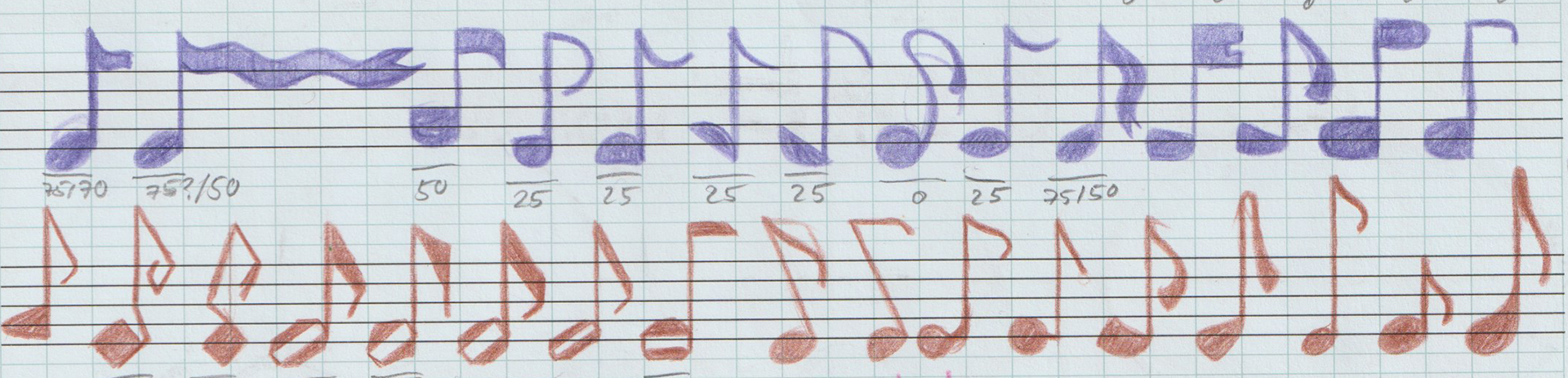
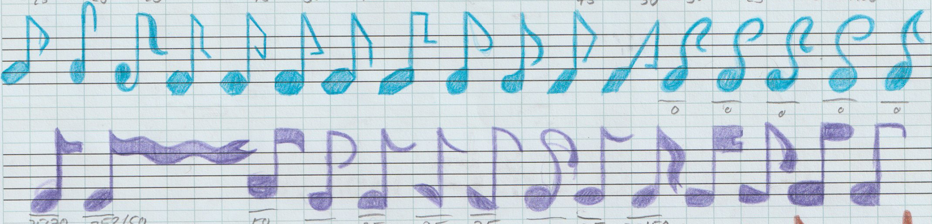
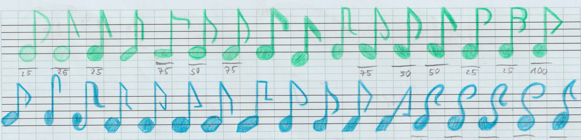
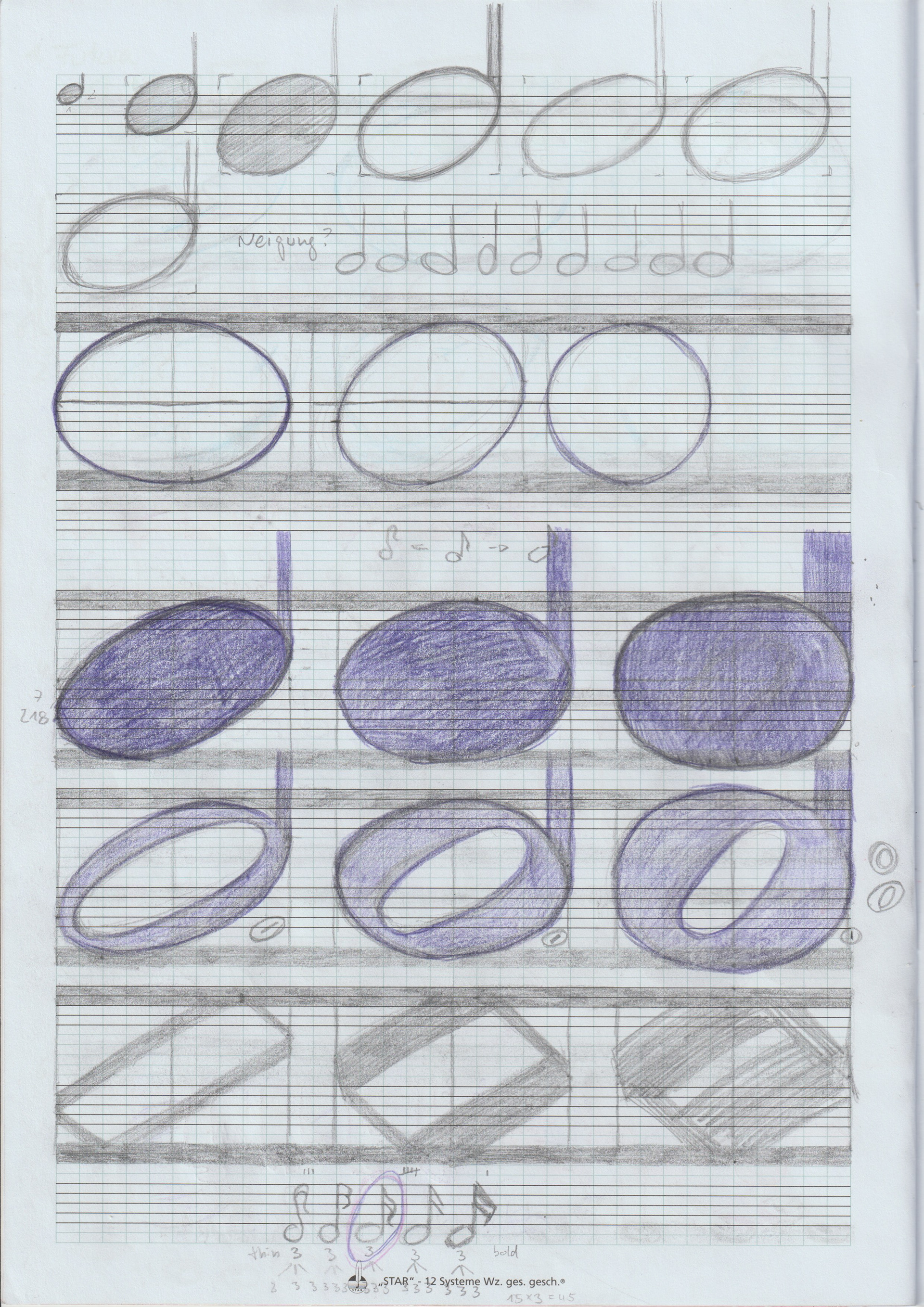
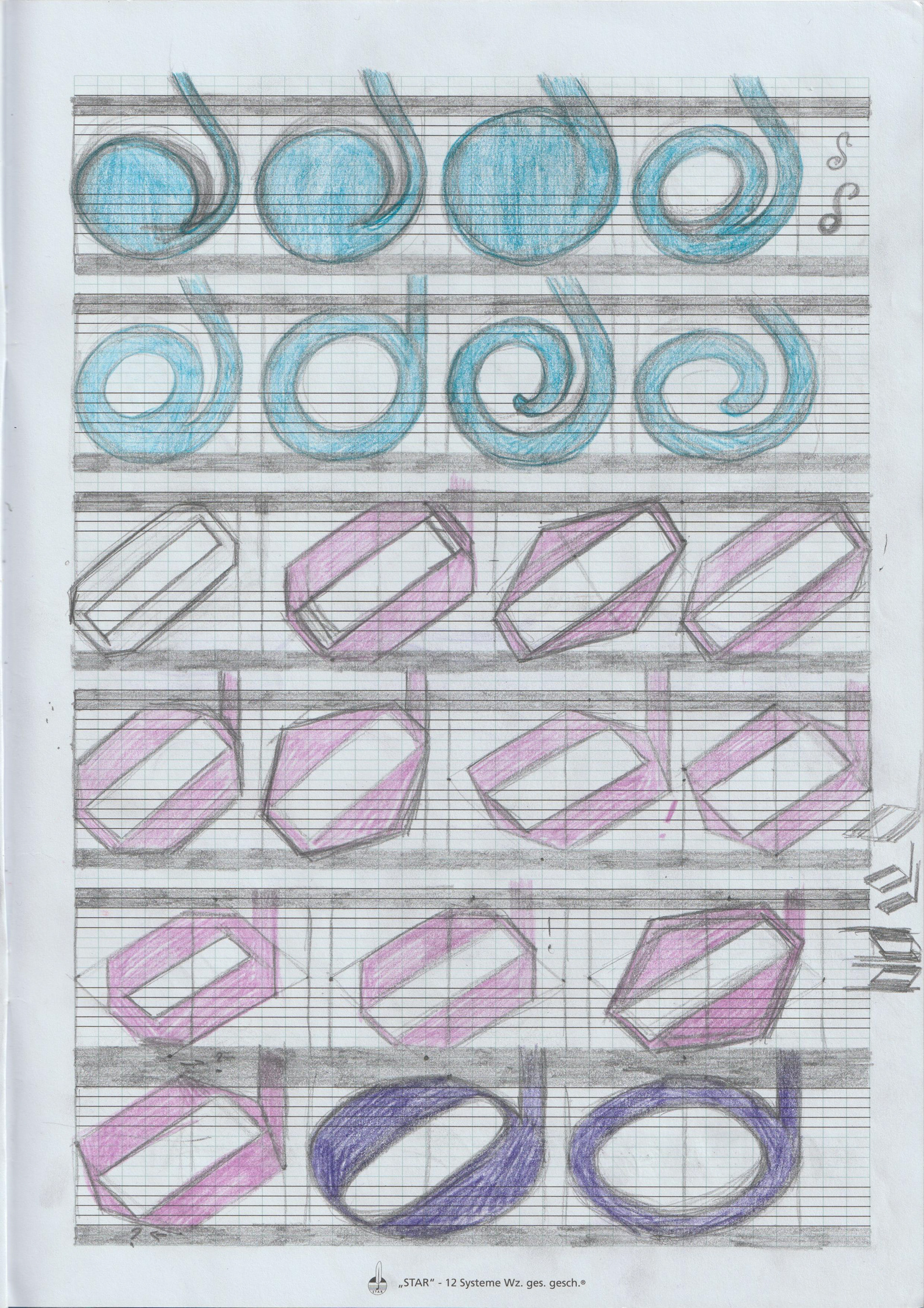
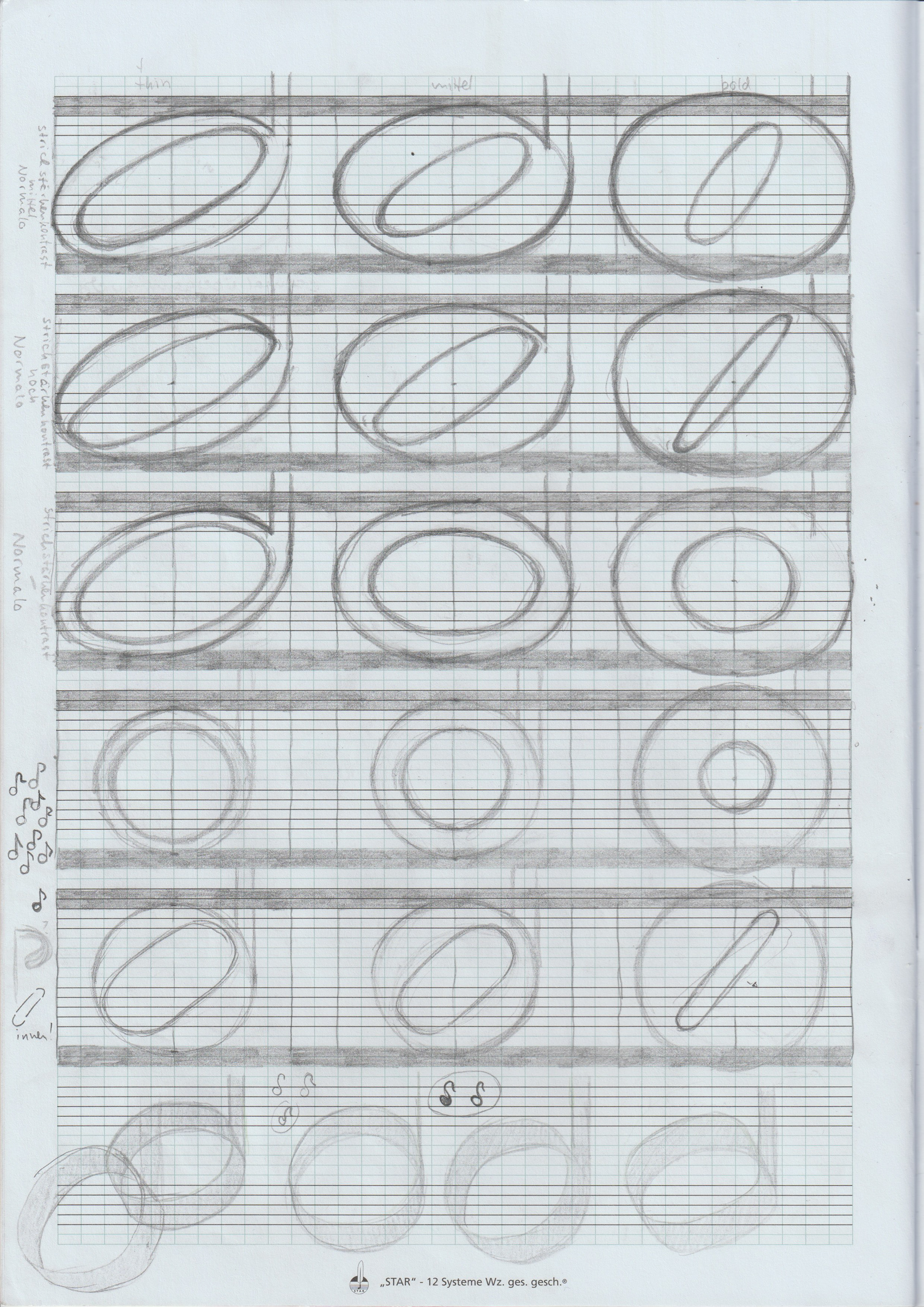
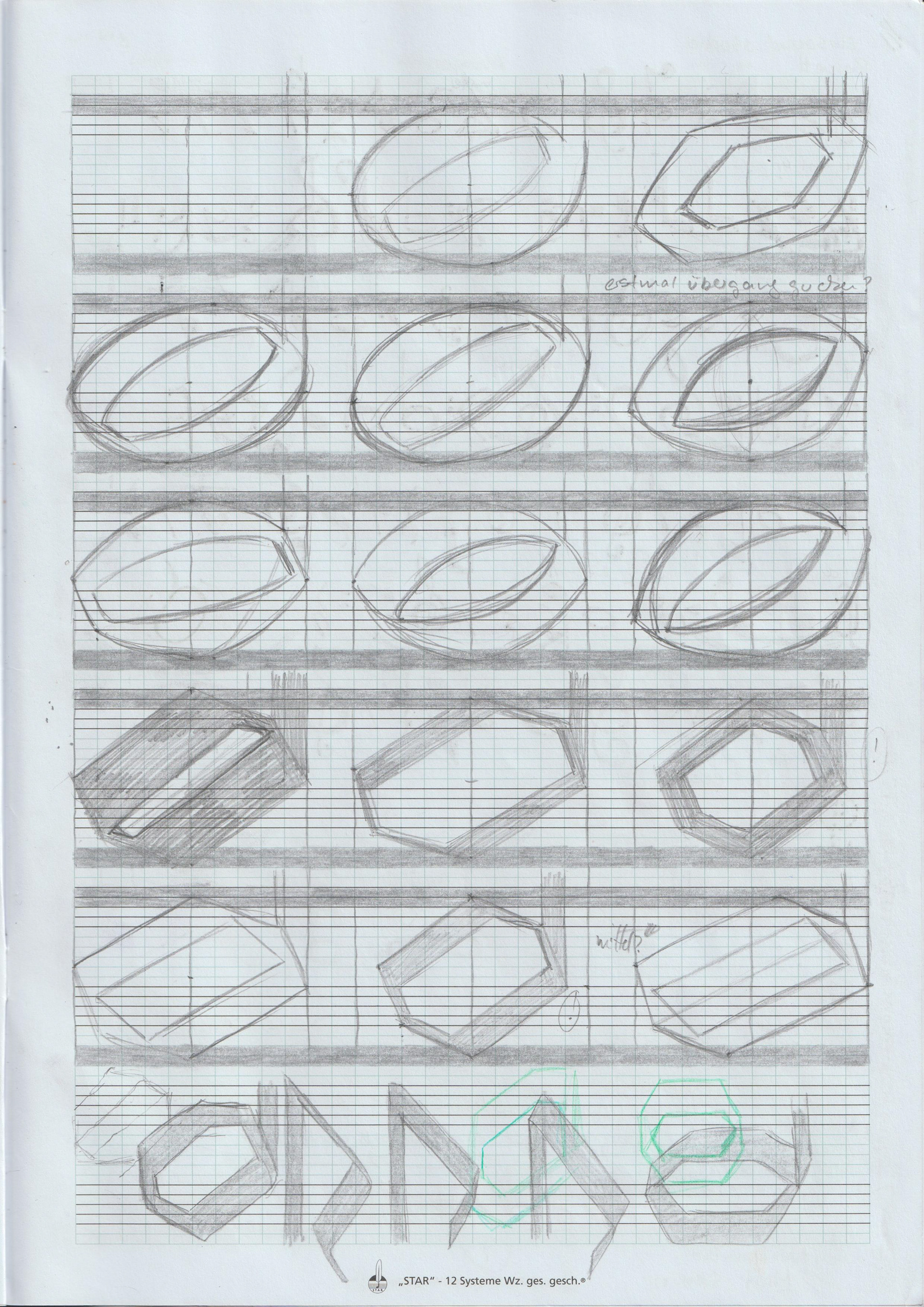
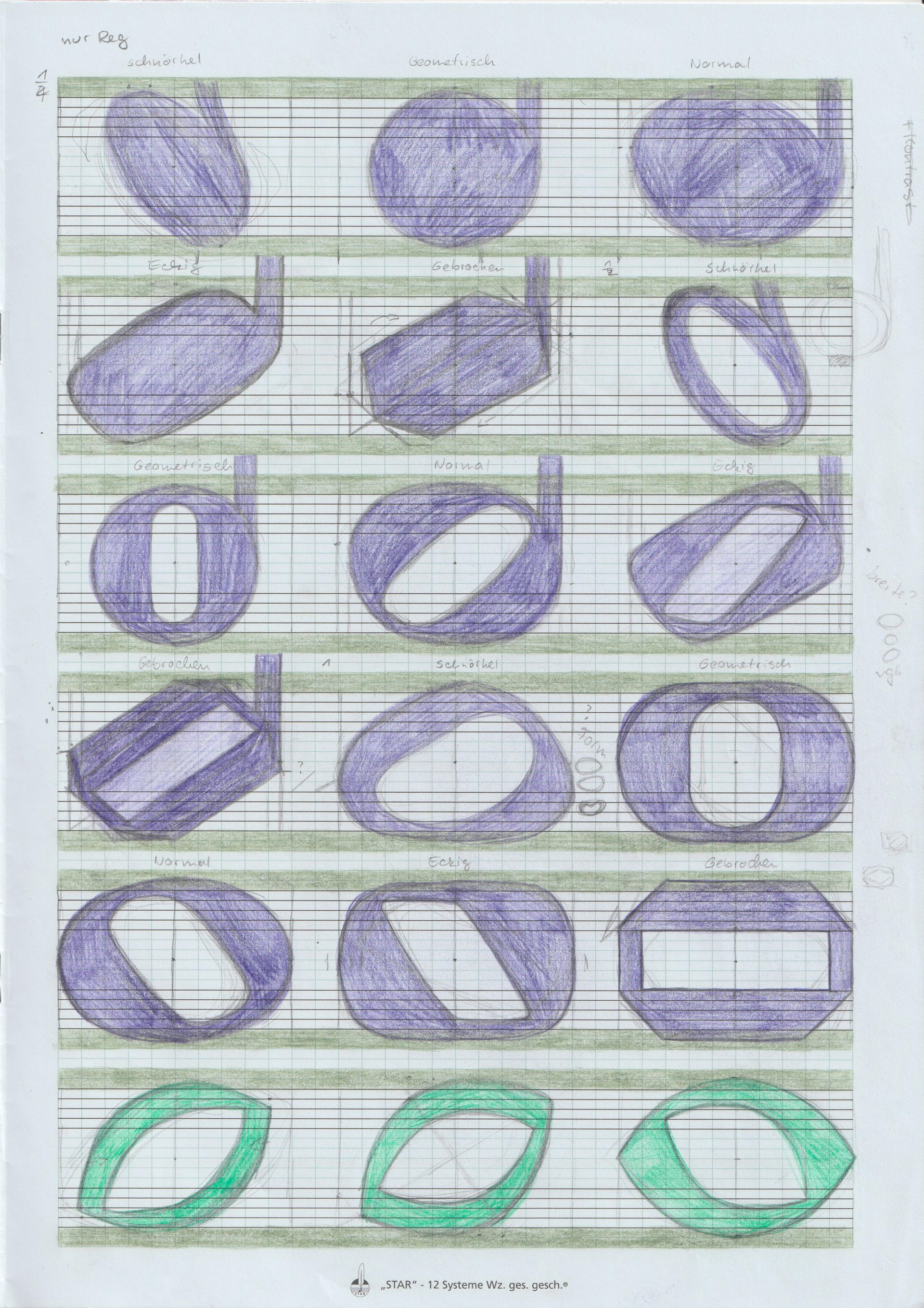
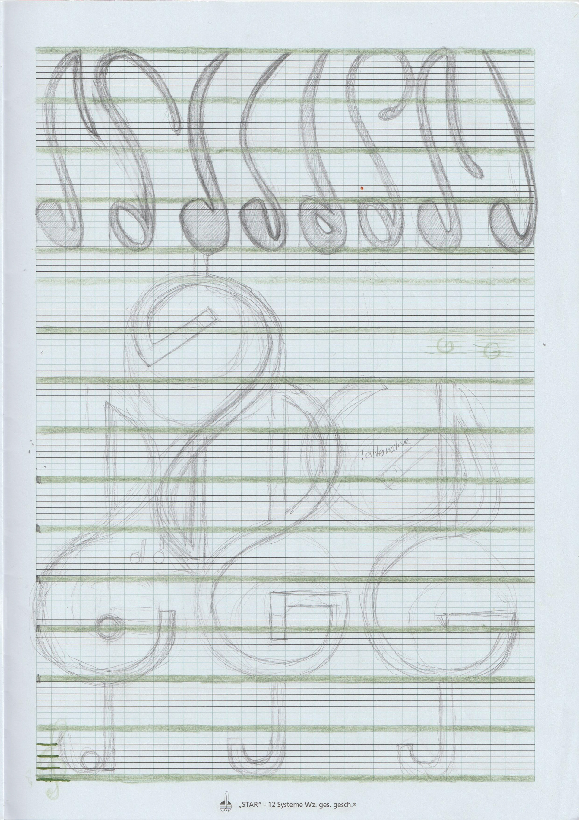
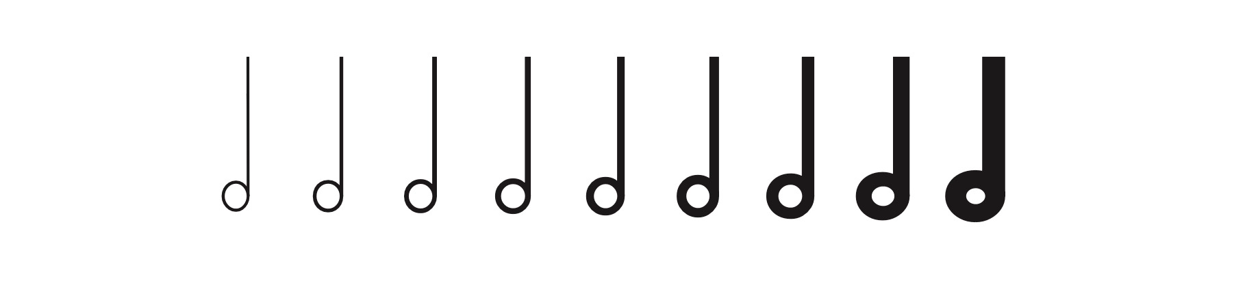
Zuerst experimentierte ich mit den Formen der Noten um herauszufinden, wie weit sich eine Notenschrift vom Bekannten lösen kann, ohne die Lesbarkeit zu beeinträchtigen zu sehr zu. Schließlich entstand Sonoritá, eine variable Notenschrift mit neun verschiedene Schriftschnitte, die den unterschiedlichen Angaben für Lautstärken in Musikstücken zugeordnet werden können (forte, mezzoforte, pianoforte, pianissimo usw.). Die breite der einzelnen Noten zeigt so deren Lautstärke an.
Zuerst experimentierte ich mit den Formen der Noten um herauszufinden, wie weit sich eine Notenschrift vom Bekannten lösen kann, ohne die Lesbarkeit zu beeinträchtigen zu sehr zu. Schließlich entstand Sonoritá, eine variable Notenschrift mit neun verschiedene Schriftschnitte, die den unterschiedlichen Angaben für Lautstärken in Musikstücken zugeordnet werden können (forte, mezzoforte, pianoforte, pianissimo usw.). Die breite der einzelnen Noten zeigt so deren Lautstärke an.
In the course of my master thesis I researched the development and evolution of western music typography. In doing so it quickly became clear, that the stylistic development only advanced very slowly since the 19th century. The bulk of music fonts used today is derived from neoclassical roman typefaces like Bodoni and Didot. During my research I examined reasons for the stagnation and talked to experts about the future of music typography.
First I experimented with the shapes of notes to find out far a music font can diverge from what is familiar without losing too much legibility. The final result was Sonoritá, a variable music font with nine different font styles, that correspond to the varying symbols for volume in compositions (forte, mezzoforte, pianoforte, pianissimo etc.). Like this the volume of specific notes can be shown with their width.
First I experimented with the shapes of notes to find out far a music font can diverge from what is familiar without losing too much legibility. The final result was Sonoritá, a variable music font with nine different font styles, that correspond to the varying symbols for volume in compositions (forte, mezzoforte, pianoforte, pianissimo etc.). Like this the volume of specific notes can be shown with their width.